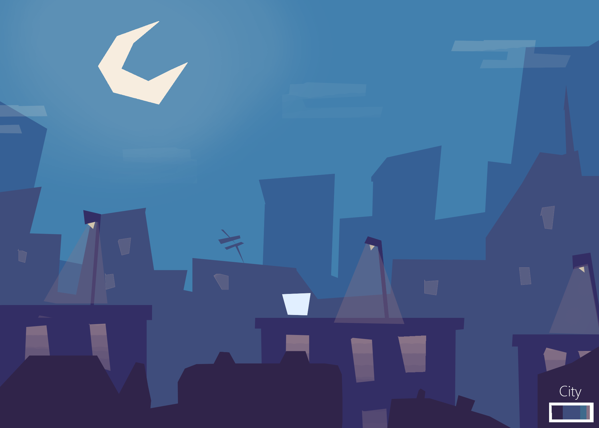
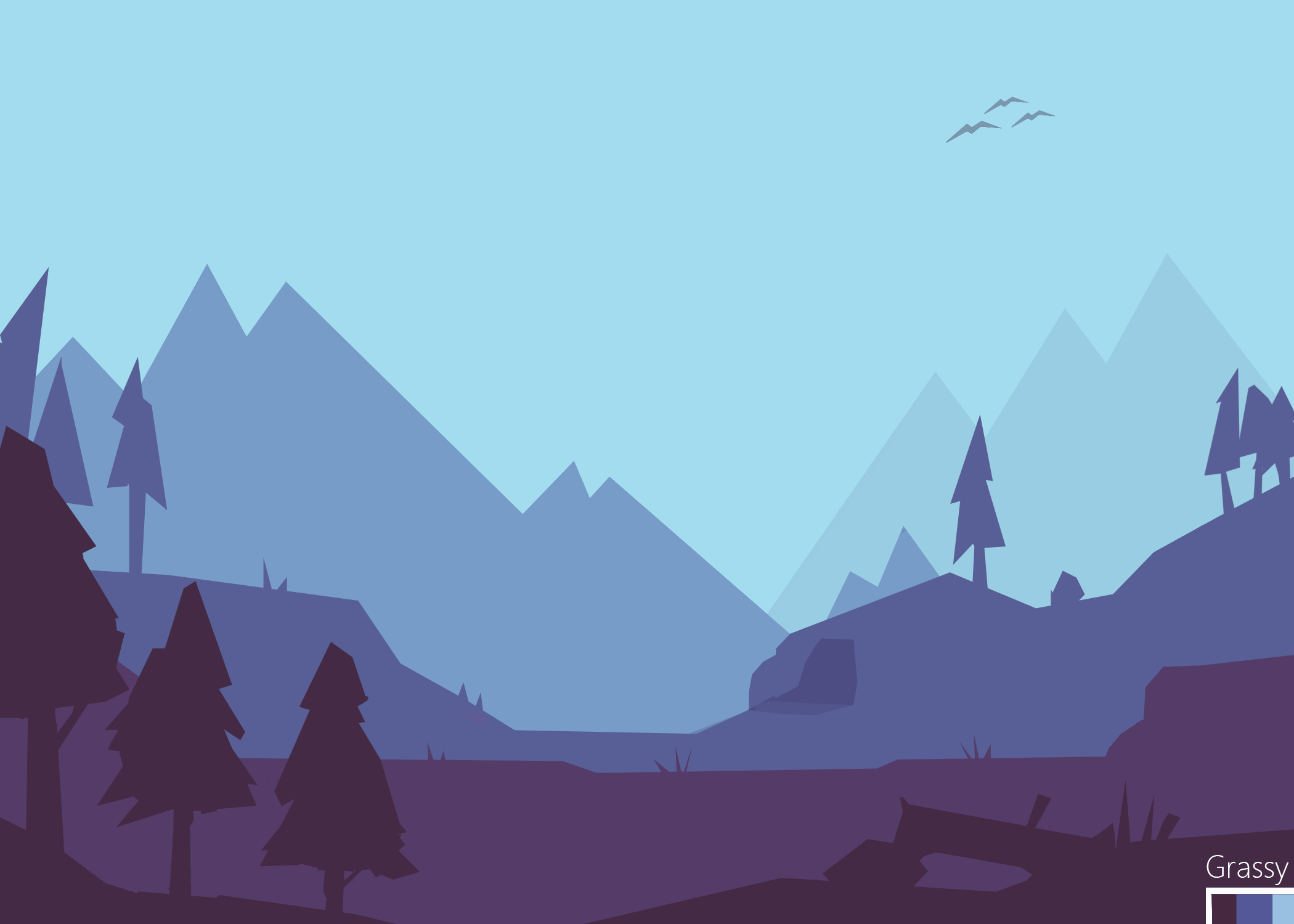
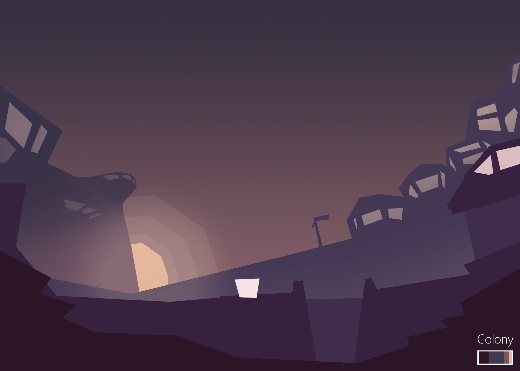
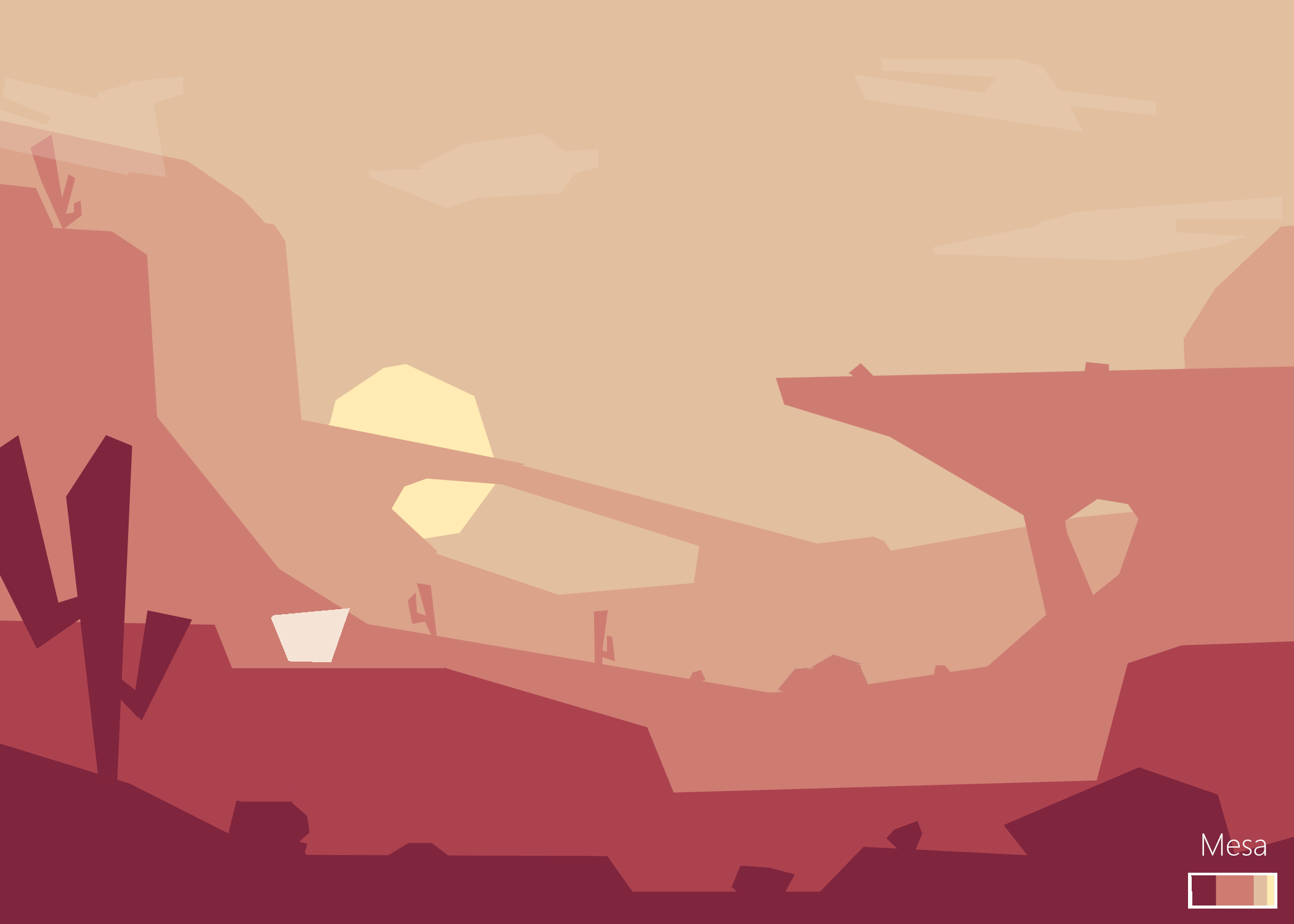
Navigate through head-scratching puzzles by controlling two pears simultaneously, in this curious 2D adventure platforming game!
Role: Game Design, Visual Design, Unity C# Developer, Level Design
Team size: 3
Date: October 2017
Scope: 3 weeks
Prompt: personal project-- create a polished experience
Design goals:
Anyone can play: accessible and visually clear puzzle designs
Familiar yet unique: gameplay and visuals should be grounded and familiar, with a slight twist to add unique flavour
Detailed: adding small interactions to bring life and fullness
Explore new concepts: learn something technical that we’ve never tried before!
Parity was made as a personal sprint during the 2017 Ontario college strike.
Building an art import system
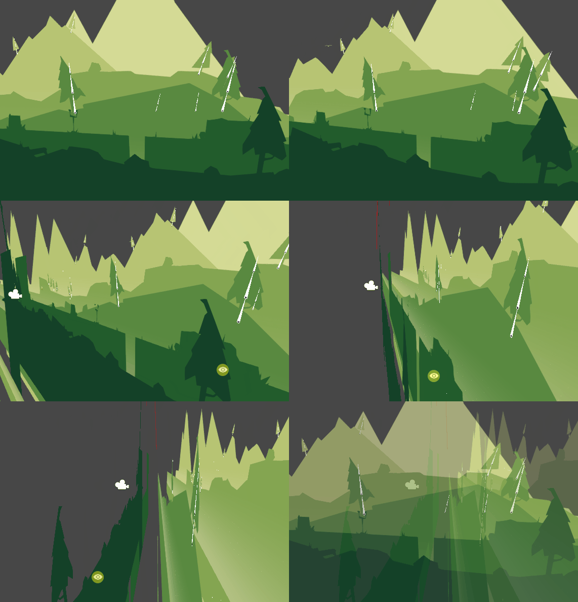
Parity has a carefully organized visual design, with the background divided into separate layers— each layer consisting of the same colour. This allows for a parallax effect while moving, adding additional depth to the background.
I built a system allowing for art assets to be imported as colourless sprites. After selecting which layer you want it to be on, it will be positionally sorted to the right layer, and coloured according to the designated layer colour. Note that this system is only possible because the whole layer is one colour!
This system also gives the advantage of quickly adjustable layer colours. We could easily test colour changes of the entire level when needed!
Visual thematic consistency
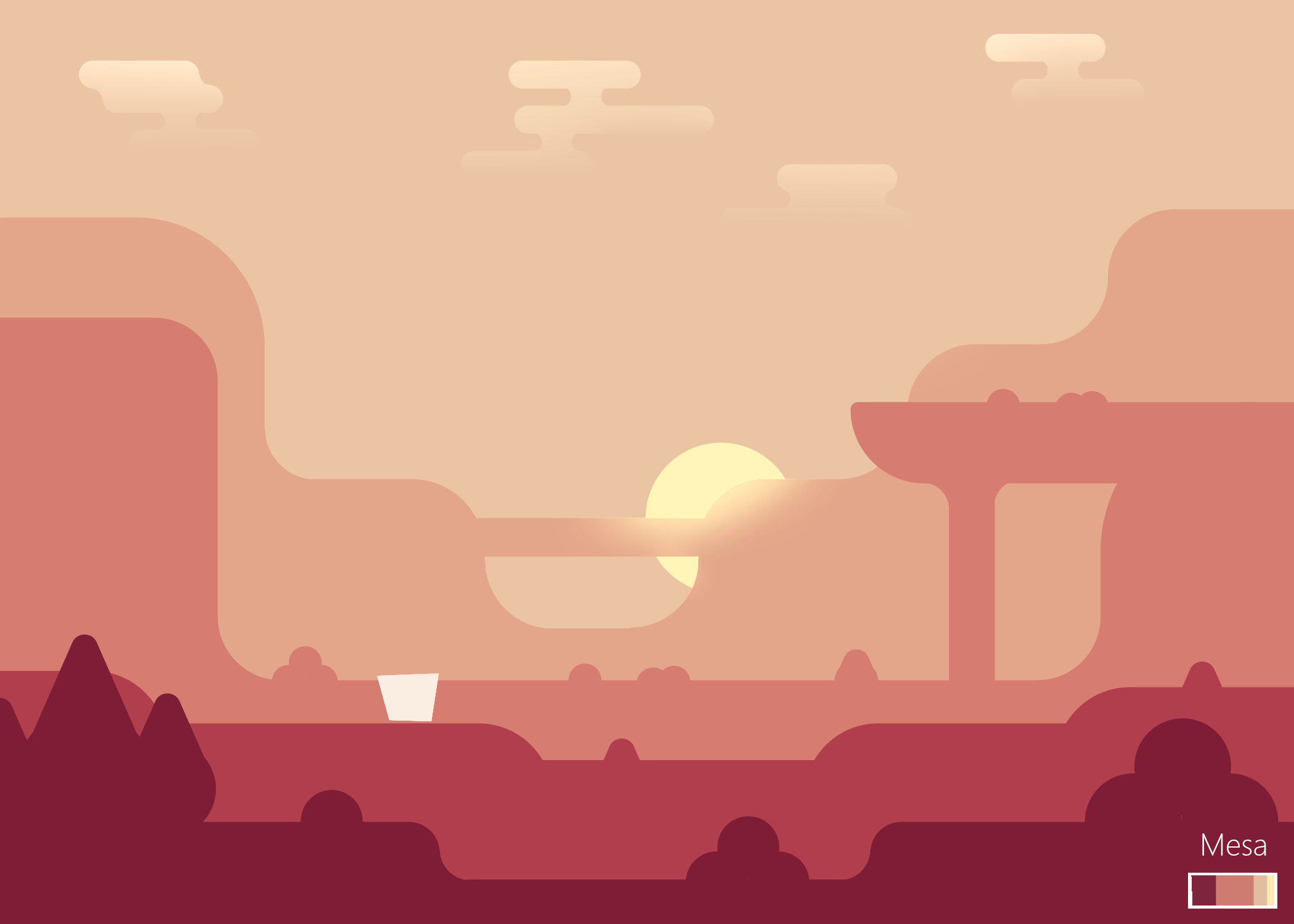
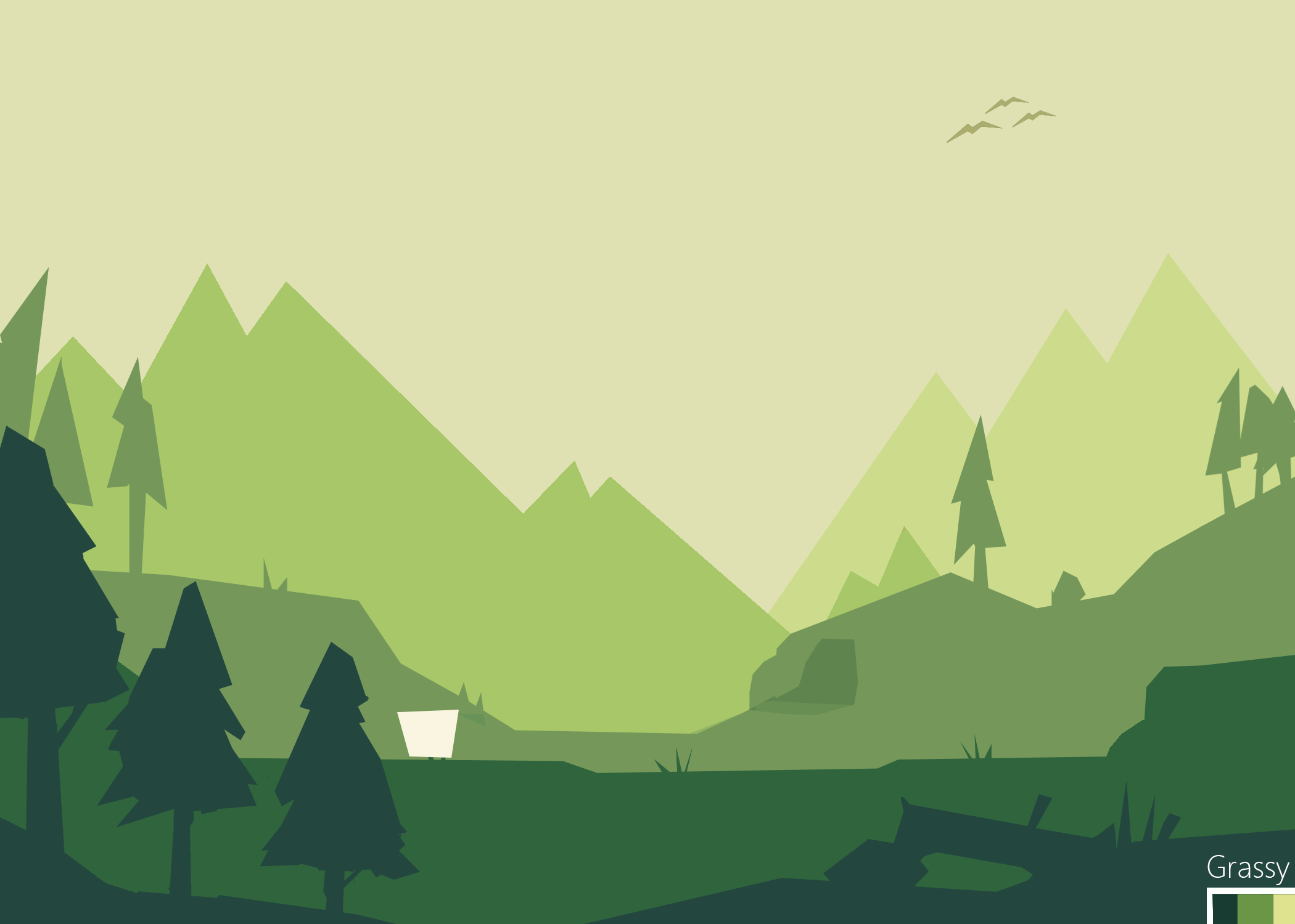
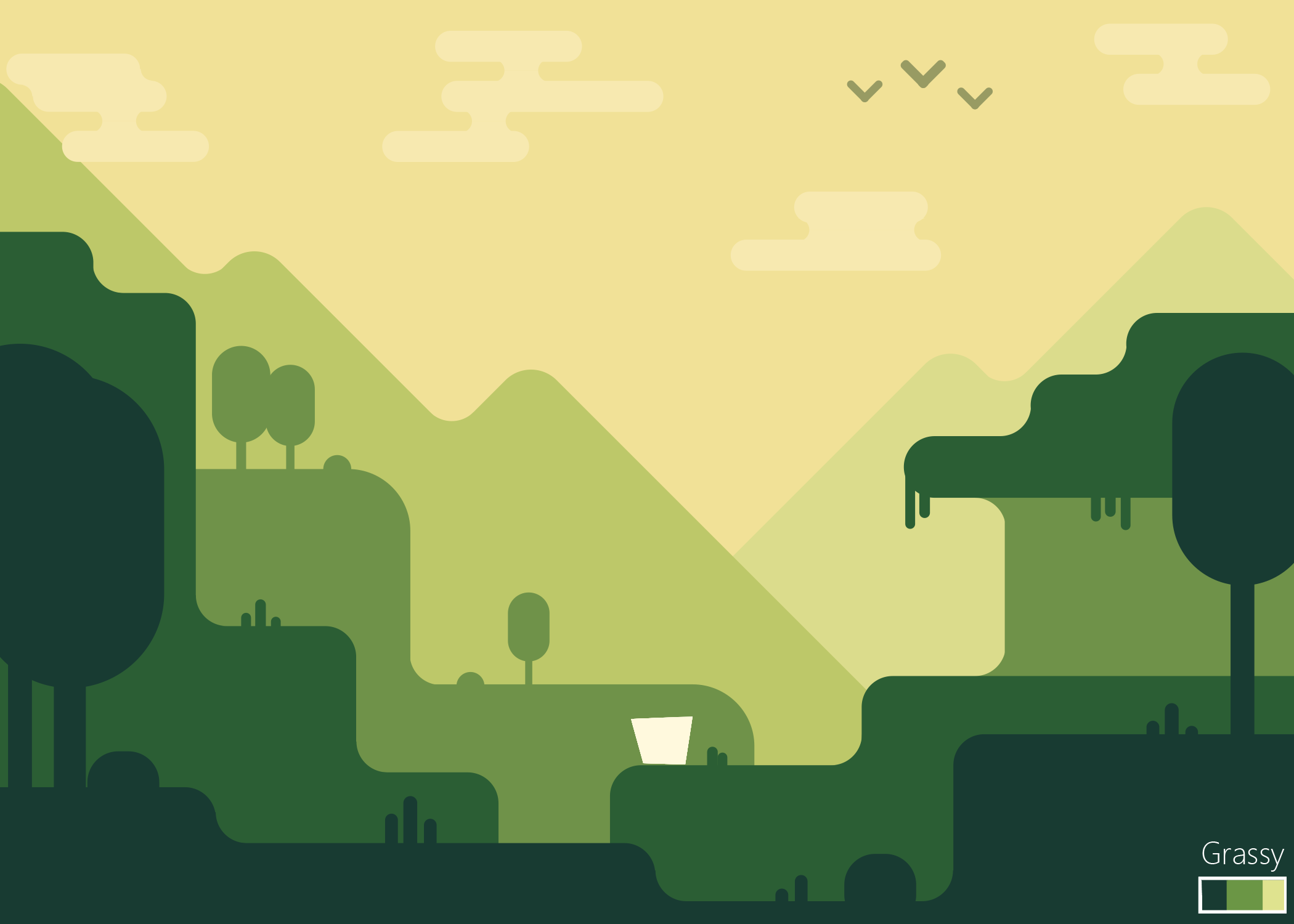
A core idea behind gameplay and level design was that each screen (top & bottom) had to feel same yet different. We wanted the visual theme to reflect this idea, while still having a strong visual impact and high gameplay clarity. My devised approach was to use shape language to establish differences between the screens, and having a consistent color swatch for clarity.
I made sure the respective equivalent props (trees, rocks) were in the exact same spot in each level, only difference being their shape. I made my own toolkit scripts to help me implement sprites, layer & colour them correctly, and give them correct bone animations.
Colour: establishing clarity
In a flat 2D game, it's very important to make clear exactly which objects are interactive and which are in the background. This is accomplished in Parity through careful selection of colours and values, along with a parallax effect to create depth.
In the forest level, layers further back have lighter values and yellower hues. The foreground has darker values and blue hues. We now have layers with visually defined separation-- all walls and platforms have the same colour, and non-interactive objects have a different one.
The player has to stand out too! The pear sprite has a yellow-red gradient to contrast the flat one-tone colours of the background. It also has a high value range, with dark eyes atop a very light body. This ensures that the pear would look distinct over any layer of the background.
The details
To add life to the game, it was necessary to think of different ways to add non-intrusive interactions. A simple method was to make ground-layer objects interactive, by giving a bit of feedback (a small shake) after walking by. Adding foreground pieces which fade out if they overlapped the player added additional depth.
Design process
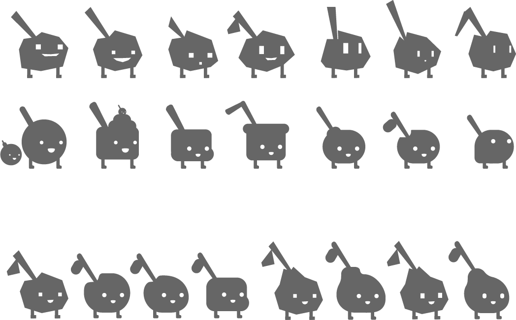
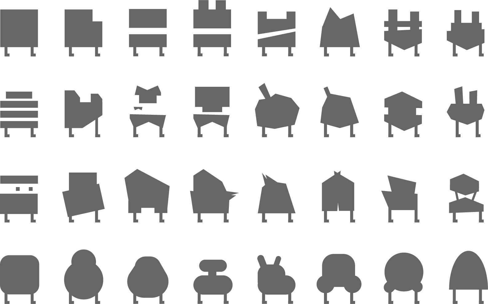
Another core goal of Parity was to test our ability to do pre-design and iteration. We didn't decide on making the character pears until almost the very end, and I'm glad we diverged so many character concepts to choose from!
Some examples of pre-design:
Multiple level environment concepts with established shape and colour language
Iterate different colours on each environment
Ensure that both round and geometric designs work
Level design: multiple level design concepts, tested but unused
Below are some of my concept designs:
