

Hackademics is a hackathon club at Sheridan college, with a mission to encourage students to involve themselves in tech-oriented competitions. As a visual designer, I created visuals and illustrations for marketing and promotional material. I worked together with other visual designers to ensure that branding, style and typesetting was consistent.
Role: Visual Designer, Illustrator, Game Design Ambassador

Brand identity:
The visual design behind Hackademics is focused on feeling friendly and approachable. There is a large public misconception on what a hackathon is, and it often sounds very technical and “hacker”-y, That’s why our visual design should contrast that public perception, and avoid using any technical-looking imagery. The social element behind hackathons are also highly under-represented, so I designed the visuals to feature characters interacting with each other.
Hackville
Promotional material for a student-hosted, beginner-friendly hackathon held at Sheridan College. I iterated concepts, dictated colours, and produced final key illustrations.
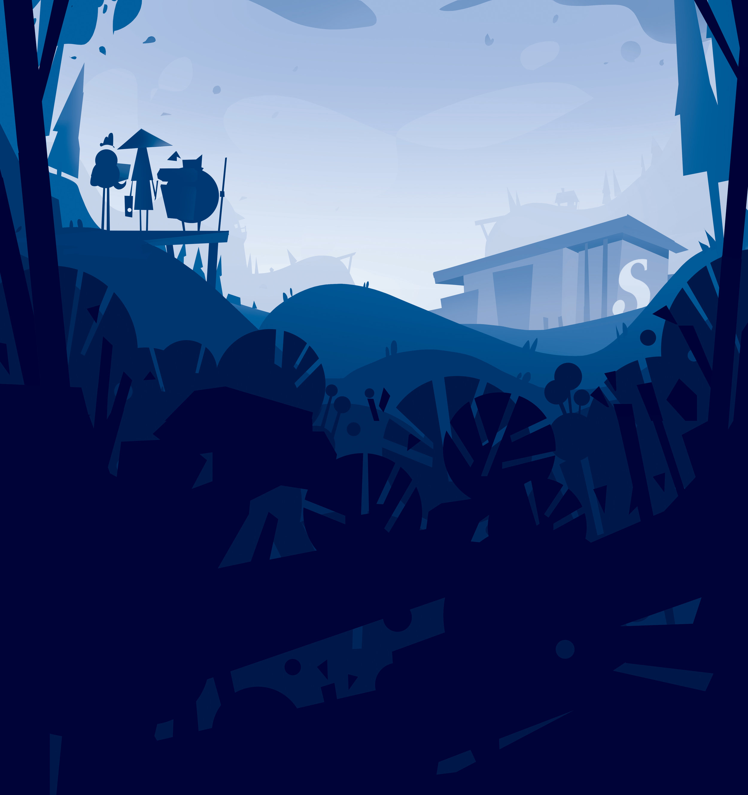
Final key illustration.
Each layer has separated colour, in descending value and saturation. This design creates a recognizable silhouette, a flat spacial design, and paves way for the use of monotone colours. A dark foreground allows for titles and logos to be laid on top of it.

Layers can be exported separately, for the potential of parallax. To demonstrate this idea, I prototyped a rough mock-up in Unity.


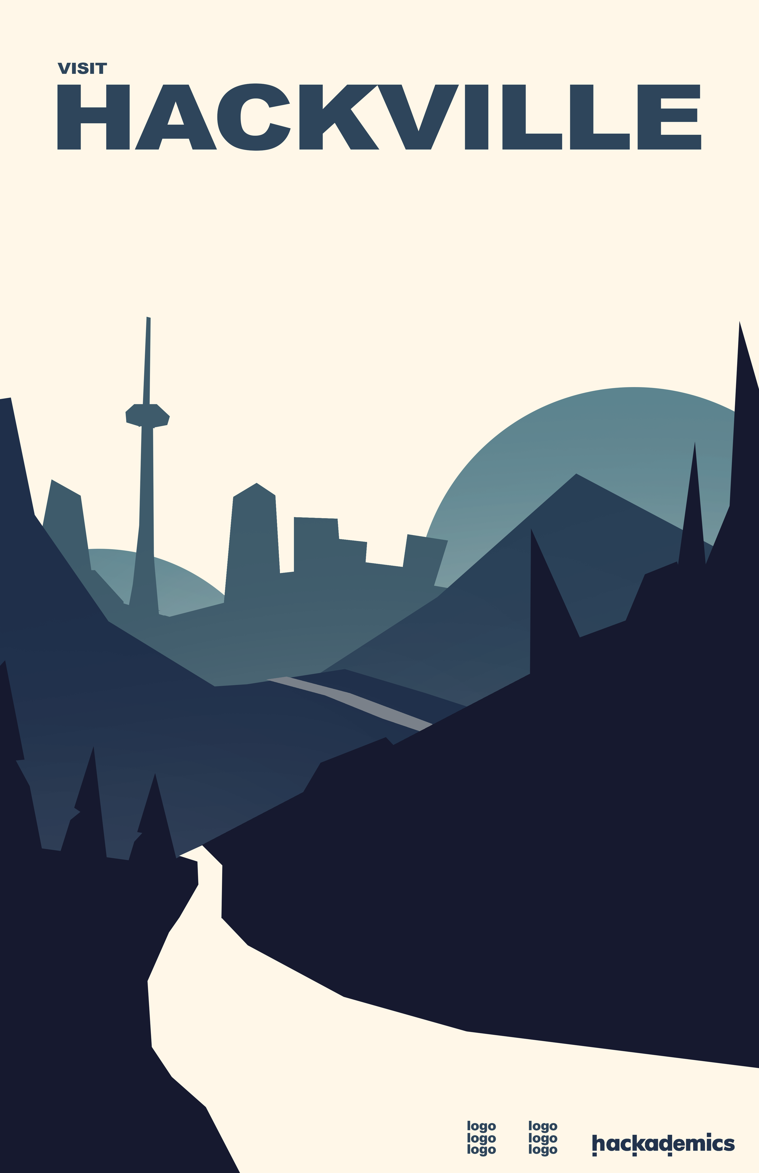
Final promotional poster:

Along with the promotional poster, I also created miscellaneous assets to other event-related graphics. Use of these assets builds a strong brand identity with the event, if all graphics share the same motifs.


Based on the principles of the first piece, I designed a supplementary illustration. It uses the same colours and layering techniques.

Concepts:
Before solidifying colours, layout and style, I created a couple of concepts to run by the team. We identified elements we liked from each concept, and I incorporated them into the final design.

+ Layering, nice foliage, good use of focal point
+ Monochrome composition is eye-grabbing

+ Use of familiar local Oakville imagery resonates with students
Illustrations
For every Hackademics event, I’ve designed illustrations for promotional material. Each piece has common motifs (blob characters), to build upon brand identity. The highly illustrative style of Hackademics promotional pieces set us apart, and captures a lot of attention.
Hand-out cards at clubs fair:


Hackathon 101 - A beginner-hackathon informational seminar:


MLH Hack Day - A 12-hour hackathon

More designs and illustrations are to be posted soon! I’m looking forward to exploration with different styles, while maintaining brand identity.