
The Game Designer’s Companion is a gamified app designed to encourage exploration and application of formal game design processes. The app was the result of a 7-week Sheridan-sponsored participatory design project.
Presented at EGLX 2018 as a panelist!
Role: UI & UX, Gamification Interaction Designer, Vector Artist, Unity C# Developer
Team size: 4
Date: Summer 2018
Scope: 7 weeks
Tools: Figma, InVision, Sketch, Flinto, Photoshop, Illustrator
The problem:
The goal was to address several impediments to game design students’ learning:
Students don’t like to read academic game design texts
Students have difficulty retaining information they learn in class
Students don’t feel inclined to attend networking/social events
Students have a hard time identifying their own skills
To address these issues, we decided to build an app that would support students’ self-learning, that may one day be integrated into the curriculum.
I was brought on as a game designer and artist, although the final prototype was an app. We decided to leverage gamification as a system for on-boarding, to better frame the project towards our skillset.
Project Process Overview:
Research
To better understand the challenge, we looked at existing companion apps, formal game design apps, and gamified apps. We analyzed what each app did well, and which elements could be improved.
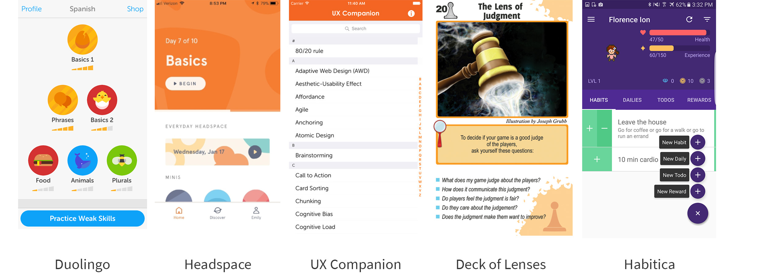
We noticed that companion & library apps have really great presentation of information, but sometimes lacks organization and ease-of use. We liked how gamified apps push the user to continue using the app, but disliked how heavy-handed some of it felt. With this is mind, our goal was to strike a balance between information, organization, and gamification.
As part of the participatory design process, we conducted qualitative interviews with our peers to understand how an app might help them.
Additionally, participants were all interested in the idea of a companion app, but had different perceptions of how they would like it to help them. We presented them with preliminary feature ideas, and gathered their responses.

We were surprised to learn that the main interests of each participant were quite different. If we were to include all these features, it may be worth keeping them separated, letting users to ignore features they don’t like.
Based on our findings, personas were constructed to simulate three different user scenarios. Our feature ideation would focus on tackling pain points that these user personas might experience. View the full res here.
Ideation
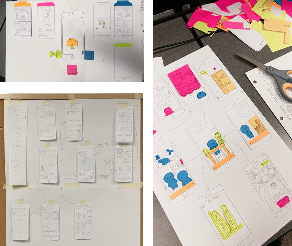
We underwent a long brainstorming and pre-design phase to explore the different ways to approach the problem. We visualized our ideas through sketches to better communicate our thinking.


We used creative problem solving processes while brainstorming: diverging and converging. This way, we could generate new and exciting ideas before evaluating them later. We valued individual brainstorming too, as a method of avoiding groupthink.

We documented all of our ideas, even the ones that were thrown away, letting us reference them in the future. Heavy documentation was required: not just for ourselves, but for the successive designers that would continue the project.

Core concept
Based on research of students’ wants and needs, we identified the three core features our app should have.

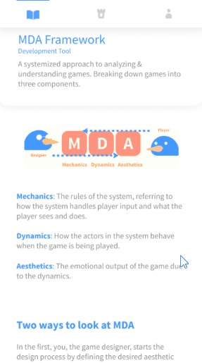
Tools: A collection of game design concepts, organized into easily searchable categories. Content is simplified and presented in a non-academic manner.
Progress: A gamified visualization of the user’s tool use, visualized through a tower. The tower grows in size when the user reads a new piece of content.
Profile: A custom profile of the user, documenting their skills, designer type, and attendance of game design events.
The three core features are tied together non-intrusively— you will never be forced to use them all. This way, the user can use the features that appeals to them most and ignore others.
How might gamification be useful?
We used Yu-kai Chou’s octalysis framework to identify which methods of gamification could apply to this concept. We implemented different ways to increase user retention, and create a smooth on-boarding process.
Growing tower: reacts to the way you read the concepts, creating a sense of ownership and accomplishment
Custom toolsets: users can assemble their own “playlists” of useful concepts and share them with their friends
Personalized avatar: a character customizable with hats, obtained by attending real-life social events
We were careful not to be too heavy-handed with these implementations. It was important to put usability of the app first— that means no unnecessary clicks, and a completely optional opt-in to the features.
Below: an octalysis analysis of the final gamified features of the app.

How can we get game designers to self-evaluate?
We used forced self-evaluation as an on-boarding mechanism. When launching the app, users are prompted to answer a few questions about themselves as designers. When finished, users are assigned a designer type (Richard Carrillo’s designer types). They are then informed to learn about what their designer type means through the content page. This way, users are presented with a natural flow of information, sparking curiosity and inward thinking from the beginning.

Optionally, users can choose to showcase a skill they’re good at, and a skill they are working on. As a surprise to many, the skills to choose from don’t include technical skills(art, programming, animation). Instead, soft skills and designer-specific skills are listed. This is a revelation to some users, indicating that having strong technical skills does not equate to being a strong designer.

Prototyping
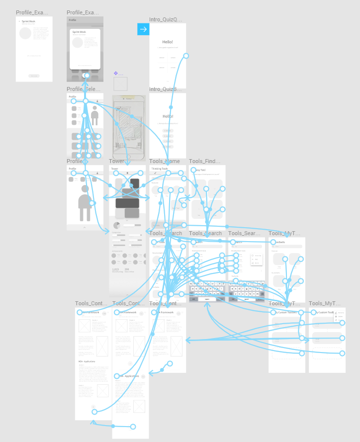
Before jumping into digital, we took some time to map out the flow of our app. Visualizing the flow and running small tests lets us better envision the concept.
After researching the best prototyping software to use, we brought our designs into a greyscale wireframe with Figma and InVision.

User testing & iteration
We performed rapid iterative testing to gauge the general response to the app. While testing the grayscale prototype, we focused on if the flow was cohesive, and if the user ever felt confused. An interesting case was how at one point, we had placeholder gear icons on buttons, and the tester thought they were buttons for options menus!

We incorporated changes based on user feedback. For the prototyping stage, we engaged in the ebb & flow of making, testing and changing, repeat.

Visual design
I was assigned to be in charge of the final layout and visual design. We identified key goals for the feeling our visuals should emulate:
Approachable: round corners, primary colours
Non-academic: strong use of colour, use of illustrations
Clean & readable: broken-up text, careful attention to hierarchies
From here, we made some mock-ups, exploring different layouts, moods and colours. Here’s a collection of some of my mock-ups and concepts:
Exploration of different styles & colours of an illustrative background.
Testing different layouts and compositions for a background piece.
Character design concepts.
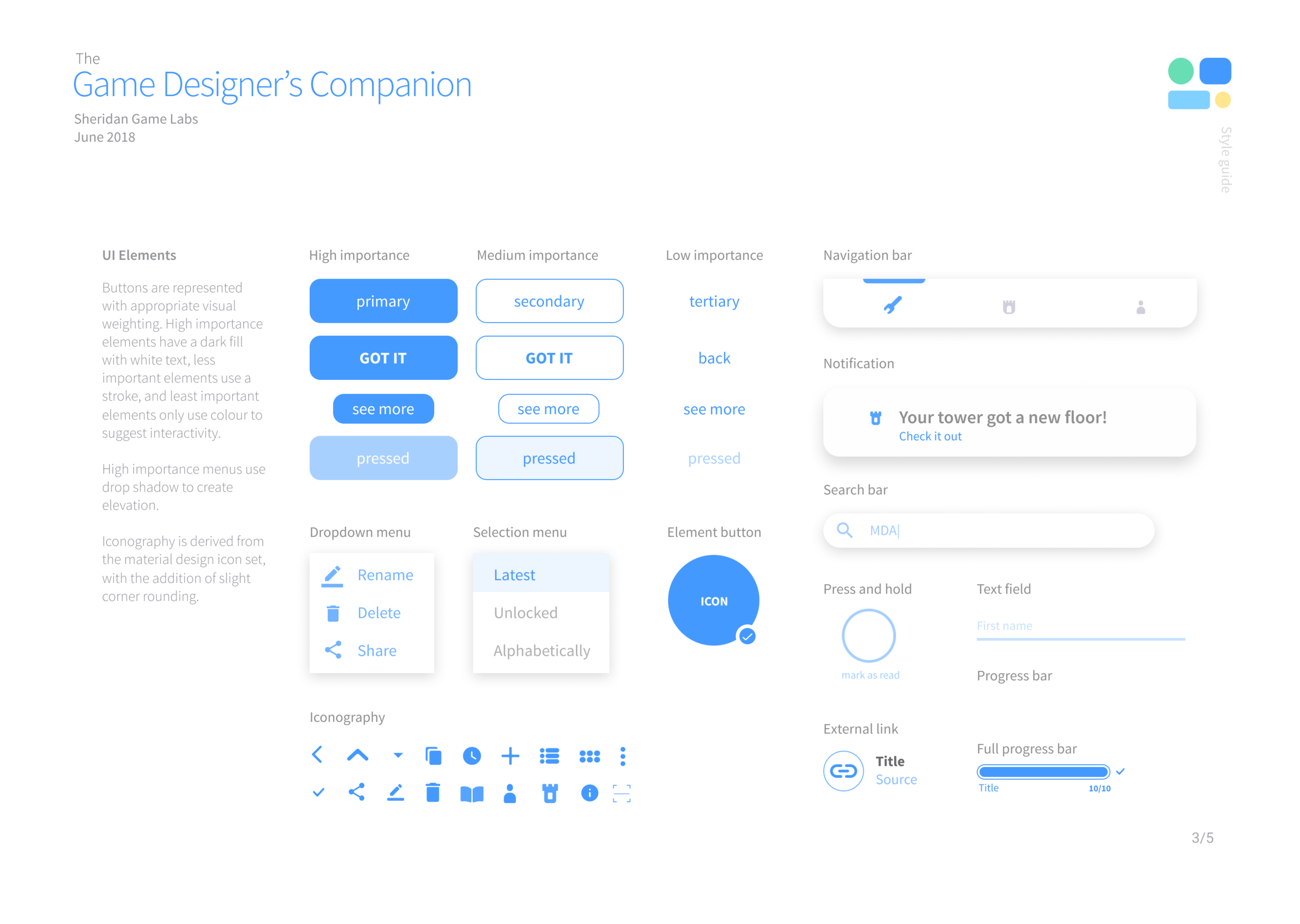
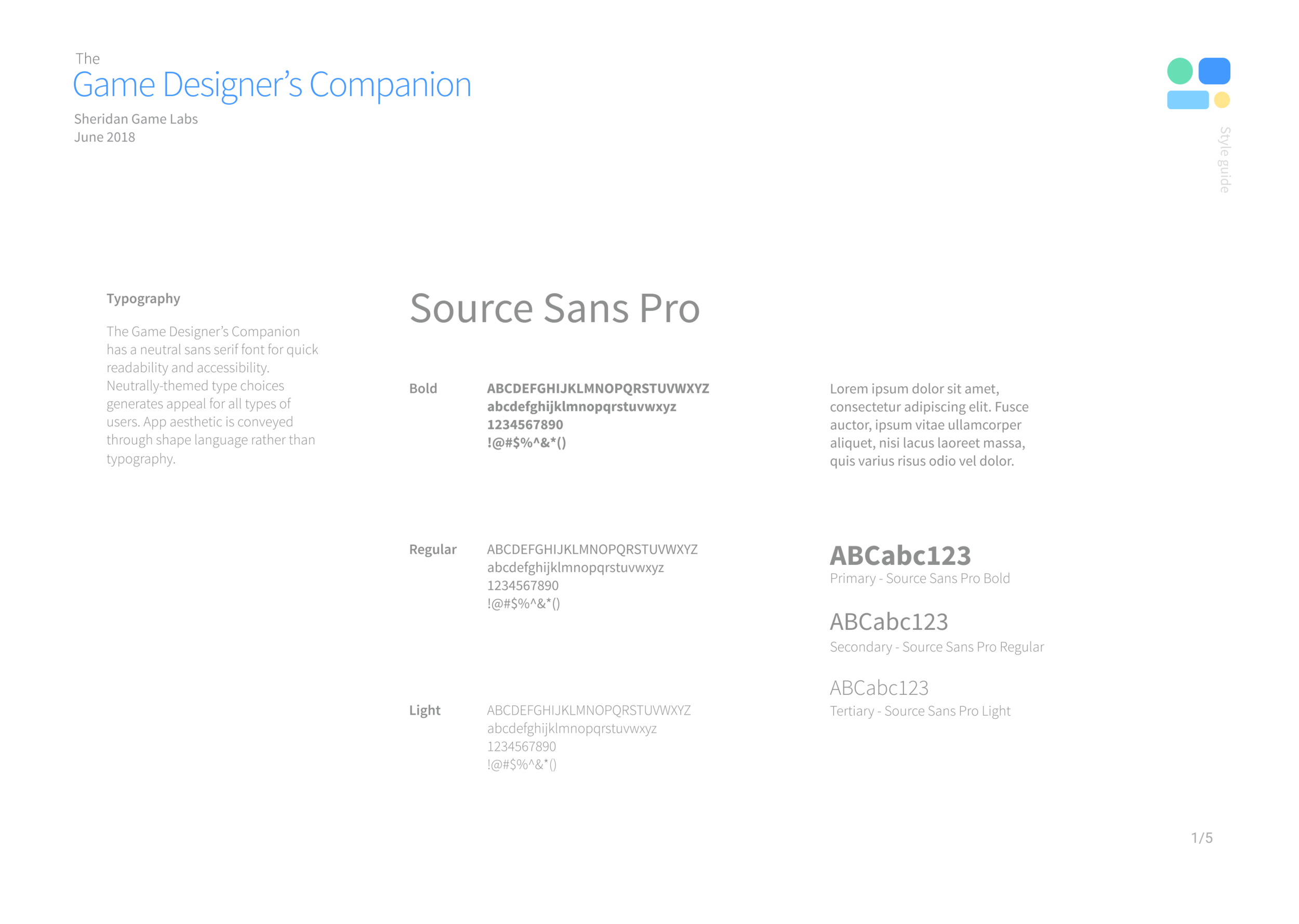
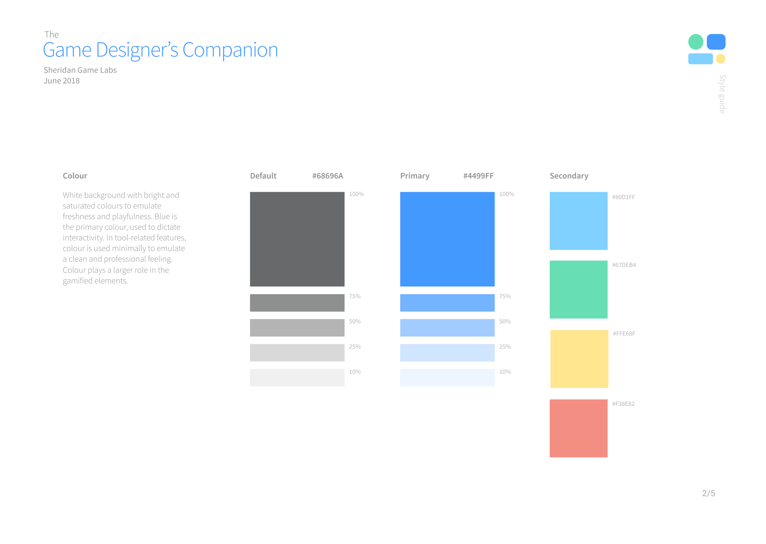
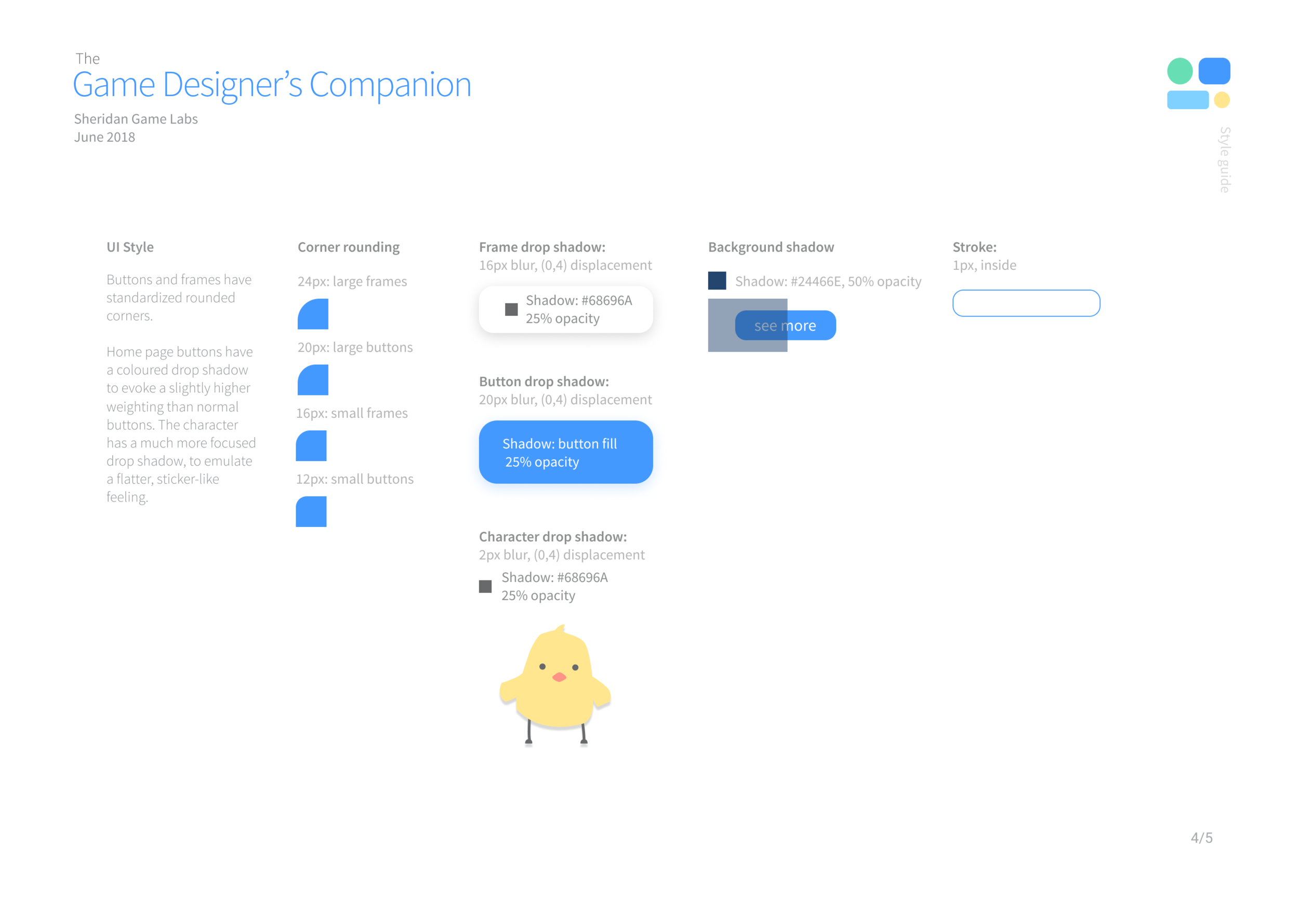
Style Guide:
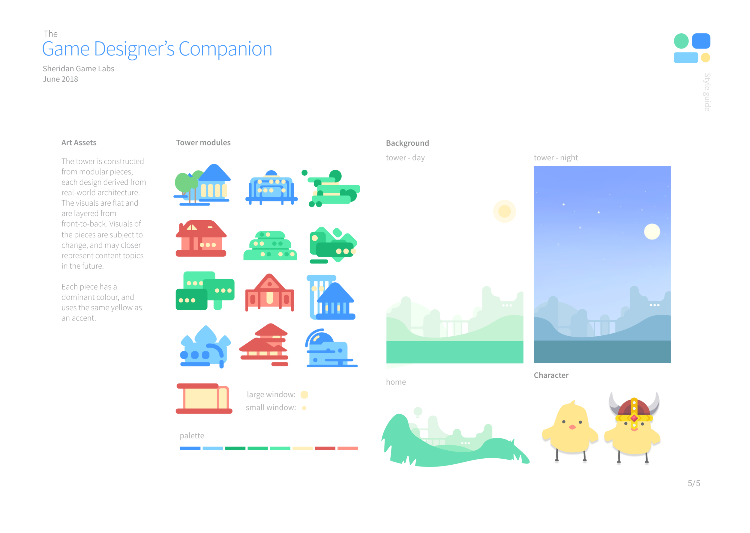
Tower Design: Iteration
After some user feedback, we discovered that the visual design of the tower was unclear, and did not resonate with users. Having each tower block only have differing architectural elements did not make sense, for how the rest of the app is themed. From here, we ventured to iterate upon a more cohesive “tower” design. We looked for references and different approaches to visualizing and gamifying progress.
I designed and illustrated multiple concepts to run by the team:

Exploration of an idea of a growing city, instead of a tower. Although it was visually interesting, it lacked a connection with the user.

Going back to the tower idea. Instead of it constructing as you read, the windows will light out, revealing silhouettes of characters. The characters would be enjoying game-related activities. We felt that this was a stronger solution, as it provided a connection, and made the tower feel alive.

Some detail tests, with a finalized tower silhouette.

The full tower design. Each room has a unique interaction. This evokes a sense of surprise and anticipation, motivating the user to unlock more floors. Once the tower complete, there will be an alive and animated tower to explore.
Final product

We spent the final week of production focused on creating the showcase video. We created a comprehensive design document, outlining all the features and functionalities. Finally, we created an annotated diagram explaining design decisions behind each feature.
Unity High-Fidelity Prototype
As a presentation piece, we created fully interactive prototype in Unity, focusing on demonstrating motion from the tower. I programmed the modular tower system and its manager scripts. Additionally, I used tweening algorithms to animate UI elements and tower effects.
Motion design for tower-block unlock flow. Satisfying unlock animation.

Using a debug tool to unlock all floors: each floor has a unique animation!

Learning outcomes:
This project was an excellent opportunity to get my foot wet in UI/UX design. Coming into this project with a game designer skillset, it was a journey of growth, and learning how to transfer my technical skills. It was from this project that I discovered my passion for UX and designing for real-world problems.
From this project, I want to translate my user-oriented thinking to any future designs I make, whether it be apps or games. Any projects I make in the future will continue to have a large focus on process work, now that I’m aware of ways to make informed design decisions.
From this team, I’ve learned a lot about project management and team communication — I want to continue to build upon these skills. I’m extremely thankful for my team and my program coordinator for such an amazing learning experience!
The project will likely be continued by Sheridan College, and hopefully built into a full application! We’ve also had the pleasure to hold a panel presentation about our learning experience, at EGLX 2018, Canada’s largest gaming convention.
